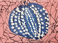
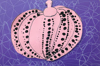
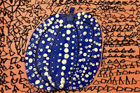
Inspired Artwork by 1st grade kids
This is a fabulous art lesson to learn about a current artist and an alternative way to create pumpkin art.
Not your everyday art.
The students explored basic design principles with opposites to create contrast within their composition:
1- black vs white
2- line design vs dots
3- warm colors (usually lighter) vs cool colors (usually darker)
I came across this art project over at Plastiquem.
The artwork explains itself, but here are simple directions just in case.
- First the kids picked from either light/warm or dark/cool color papers to draw their pumpkin on.
- Next, if they picked a warm/lighter color, then they painted with black dots. If they drew their pumpkin on a cool/dark color, they painted white dots on their pumpkin.
- When painting the pumpkins we started in the middle of each pumpkin section. We dipped our thumb to make the larger dots, then a pencil eraser top for the next size, and then a pencil tip for the smallest size. If the students were able to follow those directions, their dot design really popped!
- Once the pumpkins were dry, we cut the pumpkins out and used the opposite warm/cool or light/dark color for the back ground. If their dots were black, then they created a triangle design background with white. You get the idea.
Original artwork by Yayoi Kusama
(below)


These are just phenomenal! Great Job at teaching this, and I am going to try it in my classes. Thanks so much for sharing this lesson.
ReplyDeleteThanks!
ReplyDeleteVery good job.
Congratulations!
What a wonderful art project!! I’m very excited to do this with my art students! Thank you for posting all the great photos!
ReplyDeleteAdorable! Any tips for drawing pumpkins?
ReplyDeleteThese pumpkins are beautiful! So festive and out of the box!
ReplyDelete