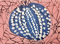
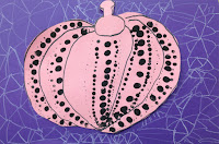
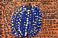
Inspired Artwork by 1st grade kids
This is a fabulous art lesson to learn about a current artist and an alternative way to create pumpkin art.
Not your everyday art.
The students explored basic design principles with opposites to create contrast within their composition:
1- black vs white
2- line design vs dots
3- warm colors (usually lighter) vs cool colors (usually darker)
I came across this art project over at Plastiquem.
The artwork explains itself, but here are simple directions just in case.
- First the kids picked from either light/warm or dark/cool color papers to draw their pumpkin on.
- Next, if they picked a warm/lighter color, then they painted with black dots. If they drew their pumpkin on a cool/dark color, they painted white dots on their pumpkin.
- When painting the pumpkins we started in the middle of each pumpkin section. We dipped our thumb to make the larger dots, then a pencil eraser top for the next size, and then a pencil tip for the smallest size. If the students were able to follow those directions, their dot design really popped!
- Once the pumpkins were dry, we cut the pumpkins out and used the opposite warm/cool or light/dark color for the back ground. If their dots were black, then they created a triangle design background with white. You get the idea.
Original artwork by Yayoi Kusama
(below)


